Get the latest Laravel/PHP jobs, events and curated articles straight to your inbox, once a week

Source: 5balloons.info
Understanding TailwindCSS Container
If you have used CSS frameworks, you must have used the container class, TailwindCSS does also have a container utility class but it certainly differs a bit from other frameworks. In this article let's understand TailwindCSS containers.
TailwindCSS have a different breakpoint which indicates the minimum width of the screen size.
By default you'll get the following container width on the screen size range
If you would like container max width on lower screen sizes then you can choose to apply max-w-screen-lg only for screen size large and above
Newsletter
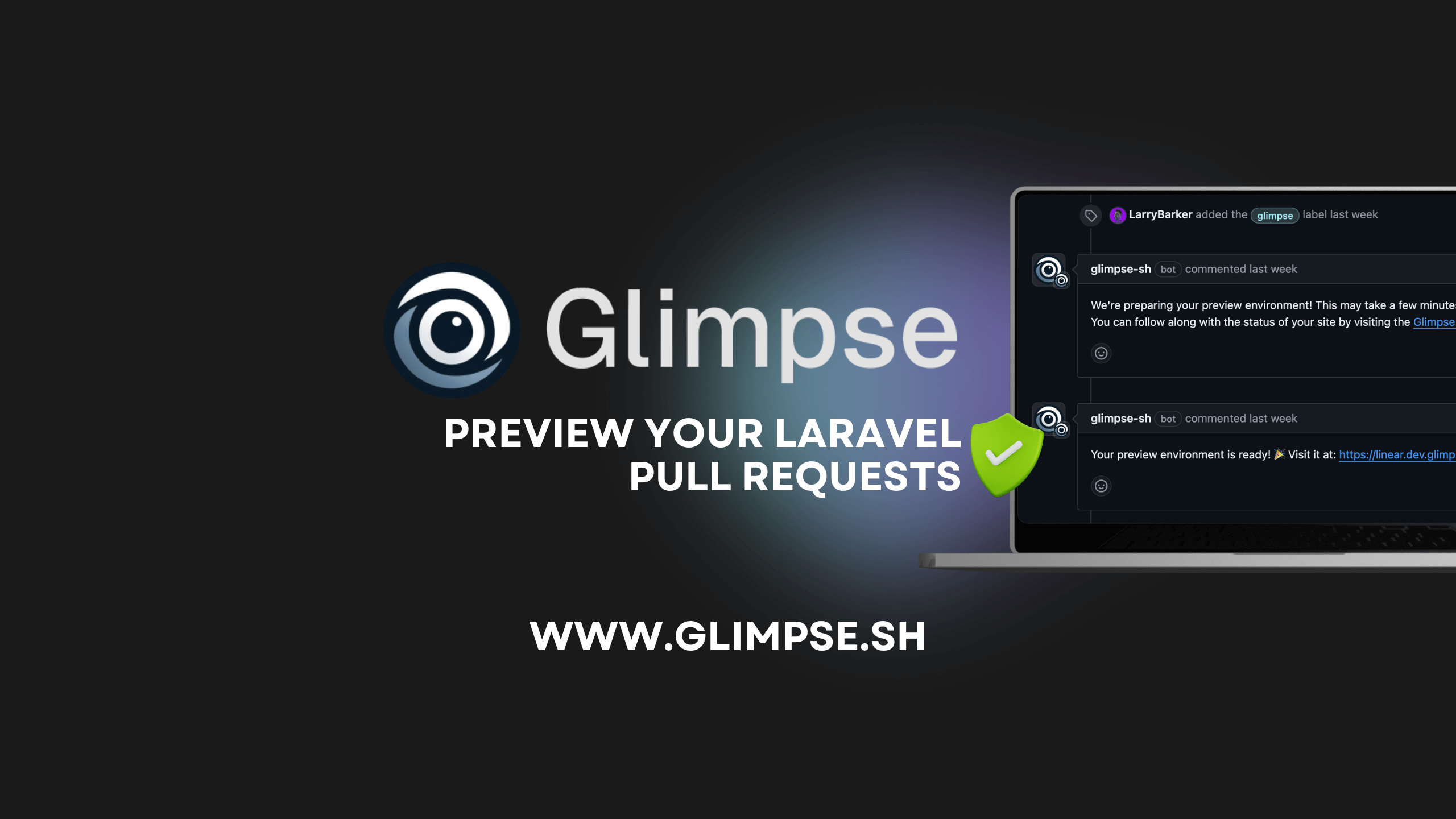
Glimpse
Glimpse streamlines Laravel development by seamlessly deploying GitHub pull requests to preview environments with the help of Laravel Forge.
Community Partners

Laravel/PHP Careers